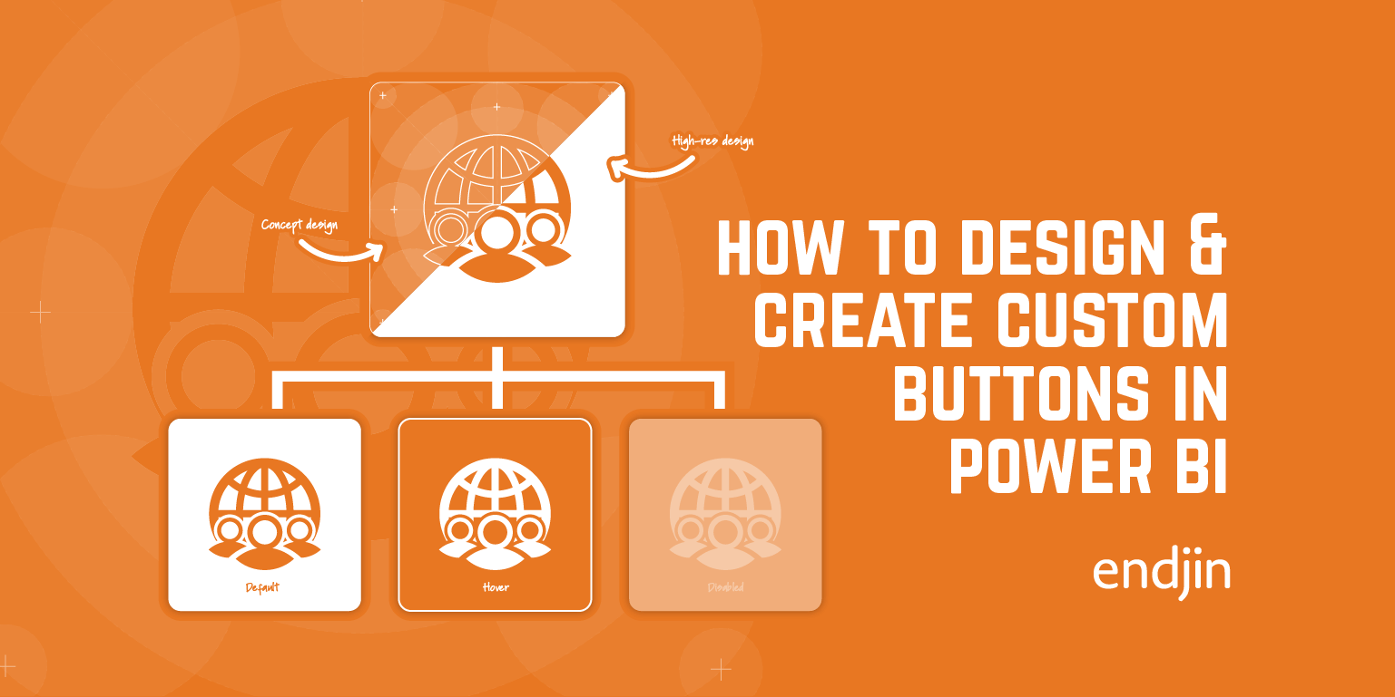
How to Create Custom Buttons in Power BI

At endjin we have been working in the Power BI space for a number of years. We're continually looking to customize our report design through themes, branding, and data visualization to give the UI a unique look and feel.
In an extension to my previous post where we discussed how customizing your reports can extend your brand language. In this post we will take you through the process of customizing a simple UI element such as a button from the foundations and basic shape, view states, adding custom icon designs, borders and how actions and implementation can visually enhance your data analytics stories within the Power BI interface.
The Basic Shape
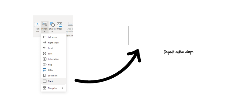
First, you'll need to add a new button from the button menu. From the dropdown select the blank option. This will drop and empty button on to your report page.
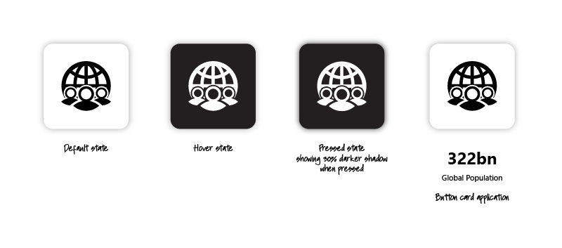
Now you have the foundation to build you button and the format panel will update to show all the button controls you will need. These can be toggled the controls on/off as you decide which features, you'll use. The key when using this feature is the interaction states: default, hover, pressed, and disabled which are within the dropdowns.
Fill & Interaction States
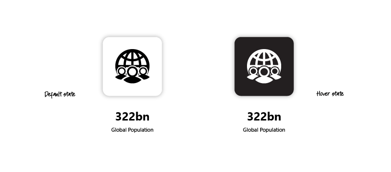
Our first style change is applying a fill to the default state. Open the fill dropdown, make sure you have the default state selected and apply you colour change. In this instance we are using white our default however, you can see from the colour panel that we have set up our brand colour in our JSON file. When you've selected your default colour change the state to hover and apply the colour for that state. Here we have opted for a black, 10% lighter.
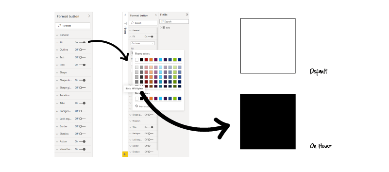
Now you can test the base interactions by moving your cursor over the button. You can then adopt the same process for the outline which we've added to help us see the boundary of out button even though this is not part of our final design.
Custom Icons & Positioning
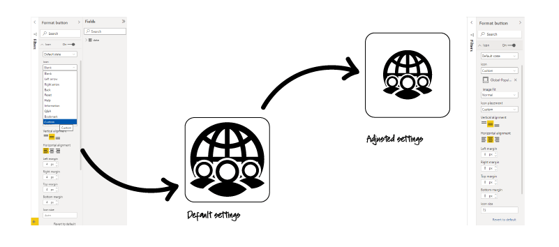
Next, we'll add our icon. If you've designed your own or you're using a library open your icon tab and select the default state. Click icon dropdown and select 'Custom' to reveal the Add Icon box. Navigate to your icon and click open. This will drop your artwork into the button which will fill the total area.
Now you can adjust you position to align left, right or center. You'll also be able to set explicit margins and icon size and you will see your icon change within the frame. We tend to set our icon size to the same as the origin size. What we mean by this is we draw our icons at 48, 72 or 96px then we apply to a 1px boarder to the artboard to avoid unwanted hair lines appearing within our buttons.
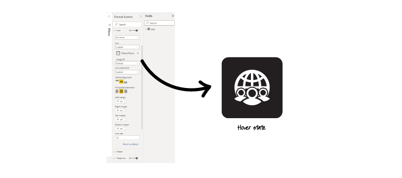
If your icon takes changes on hover, then toggle the button state to hover and apply the alternative version. If you've set up your margin and position on the default state, then your hover state will adopt the same size and position. If you accidentally start in the hover state, then you'll have reset the margins and position across each state so it's good to make sure you're working in the right interaction state before importing your artwork.
Again, regularly test the interactions are working as intended.
Border
Now we're going to look at our boarders and replace our outline with a subtle glow. To generate this effect, toggle the Shape Shadow on which will apply the default settings.
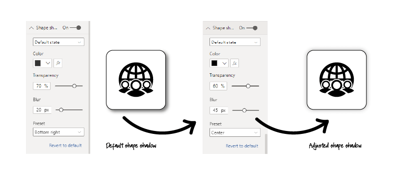
You'll notice a drop shadow appear bottom right. We want to adapt this to a softer glow around all edges. In the shape shadow format panel, we select black for our colour, drop the transparency to 60%, increase the blur to 45%, and center our blur position. There's on last thing to do and that's to turn off the outline guide and there we have it a custom button in Power BI.
Actions & Interactions
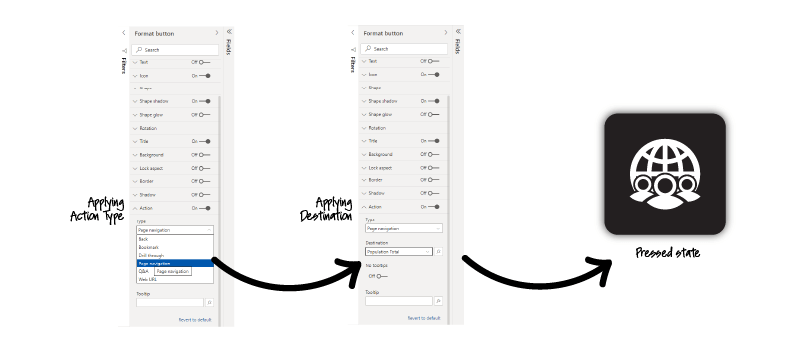
Finally, our button would not be complete without assigning an action to it. Open the action panel and expand the action Type dropdown. This reveals a series of actions available. You will see that you can assign actions to go Back, Bookmark, Drill through, Page Navigation, Q&A, and Link to Web URL. In our case we will be using our button for page navigation. Select your chosen action, add a destination which will be applied to your button when its pressed and that's it you now have a fully working custom button in ready to use in your Power BI interface. If you needed to incorporate more buttons for navigation and stylized links, then copy your initial button as this will retain all the button states that you have added and change the icon and action as required.
Final thoughts
In this post we have walked through how to build custom buttons in Power BI, how they can help to enhance and add an extra layer of interactivity to your reporting and analytics UI. The process is quick if you have all the collateral ready, it takes minutes to compile a button that reflects your brand language. It's Ideal for instances where you require bespoke navigation, bookmarking, and links. You can extend your brand language through design and developing icons for new instances. However, if designing is not your primary focus, then the feature comes with a series of packaged default icons ready to use. It's a great way of extending your visual identity across all aspects of your data visualization and reporting UI.