How to Build Navigation into Power BI

At endjin we have been working in the Power BI space for a number of years. We're continually looking to customize our report design through themes, branding, and data visualization to give the UI a unique look and feel.

In this post we are going to overlay UX practices and build on them and make reporting look more considered and intentional. We need to build stories and journeys into our reporting because data has a story. It’s about exposing and surfacing these topics and meaningful outcomes from the data we are presenting.
One way to add formal UX practices is by integrating navigation. This allows you to taxonomize and categorize our data across your user journeys and touchpoints. Navigation follows patterns, you would normally find our main nav at the top or the left-hand side of the page. Then there is local navigation which could be a sub nav within a section down, then we have contextual navigation. This takes the form of links within the body of the text which link out to articles.
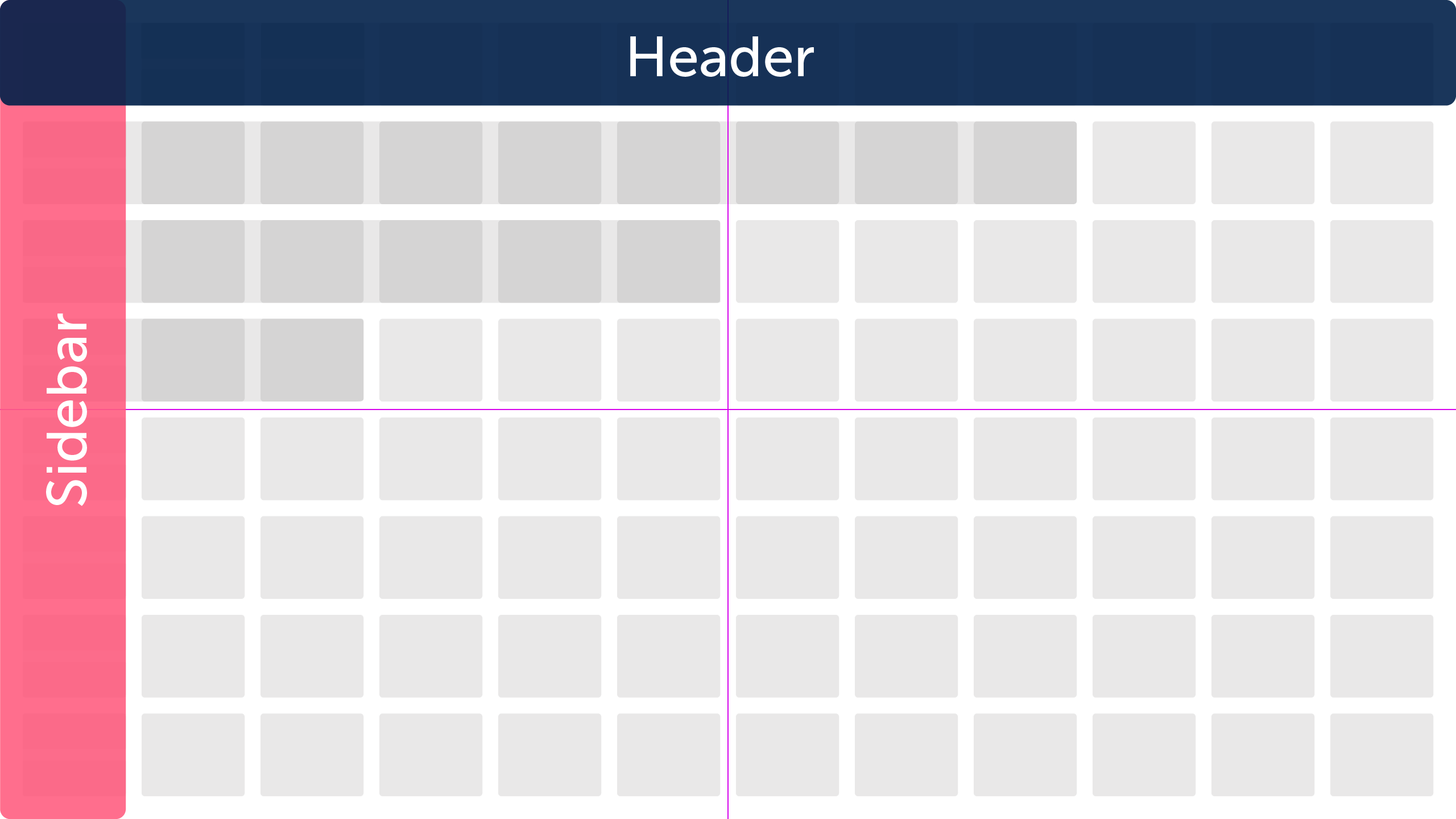
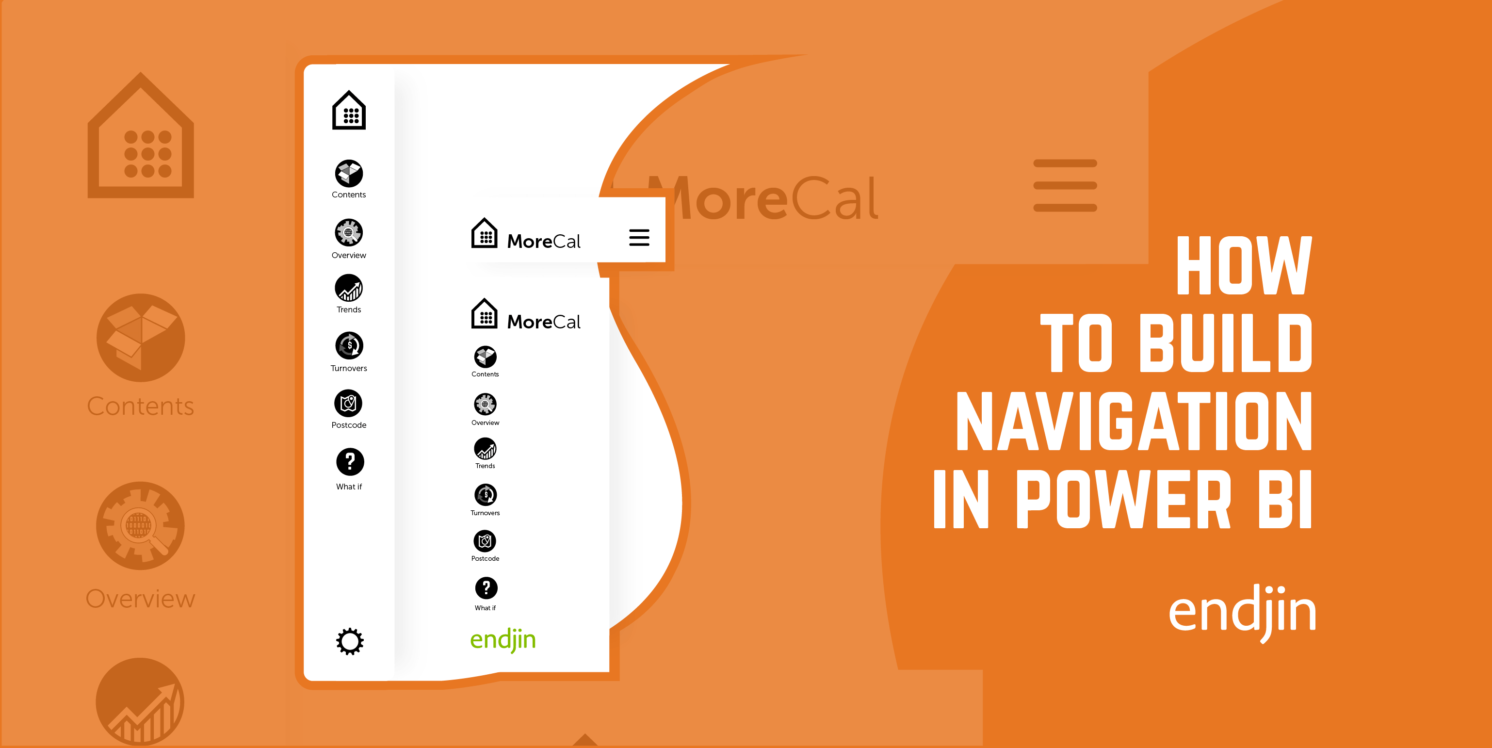
At endjin we have been experimenting with different ways to add navigation to our reporting. The first pattern we use is where we host our navigation on one page and channel our audience down individual journeys utilising drill-throughs. This works best when we are hosting multiple user journeys within one report, or the report applies to more than one audience type. The second navigation pattern that we adopt is where we add side navigation. This type of navigation works best when we are delivering one cohesive data story. The difference between the two navigation approaches is the first option is heavily directed towards extended user journeys where and entire section is the data story. The second approach works best where we are not exposing multiple user journeys within the data and the report is a continuous data story.
With side navigation - which is what we are going to build - you can feed the story and what you deliver across a range of topics. Another important thing about navigation is it allows us to categorize our content so that we do not end up overloading our pages with more content than our audience can manage. It can get confusing if there is too much content on the page.
Building your Navigation
Convention dictates where are navigation will be placed. Your audience will often start in the top left corner and look across the header or look down at the left-hand side of the page. These are the conventional places to host your navigation. Make your title for each section short, descriptive, and to the point. Your audience will be looking for titles that accurately describe the section or topic they are looking for. We often have an ‘Introduction’ and a ‘Contents’ page where we deliver an outline of what the report is about and the best way to navigate it. So, the first step is deciding the location of your navigation along the header or down the side.
![]()
At this point we start thinking about the creative collateral that we might need. Icons for the navigation, general iconography, branding, and supporting illustrations. Whilst we design our creative collateral, we swap Power BI for Adobe Illustrator so we can design a suite of icons indicative to the navigation. Each topic is different, so we design a suite of icons specifically for that topic. We choose to design our icons because it is in our skill set but there are a variety of good, predefined icon libraries out there namely The Noun Project, Flaticon, and Fontawesome.

The more sections you have will depend on the quantity of icons that need to be designed or sourced. Whilst we’re in illustrator we design and develop a mini brand if there isn’t a brand already or its not client facing work so that we can give the report its own Identity. It helps us to distinguish the report unless we are using a client’s brand guidelines. In which case, it will be dedicated towards their brand and colour palette.
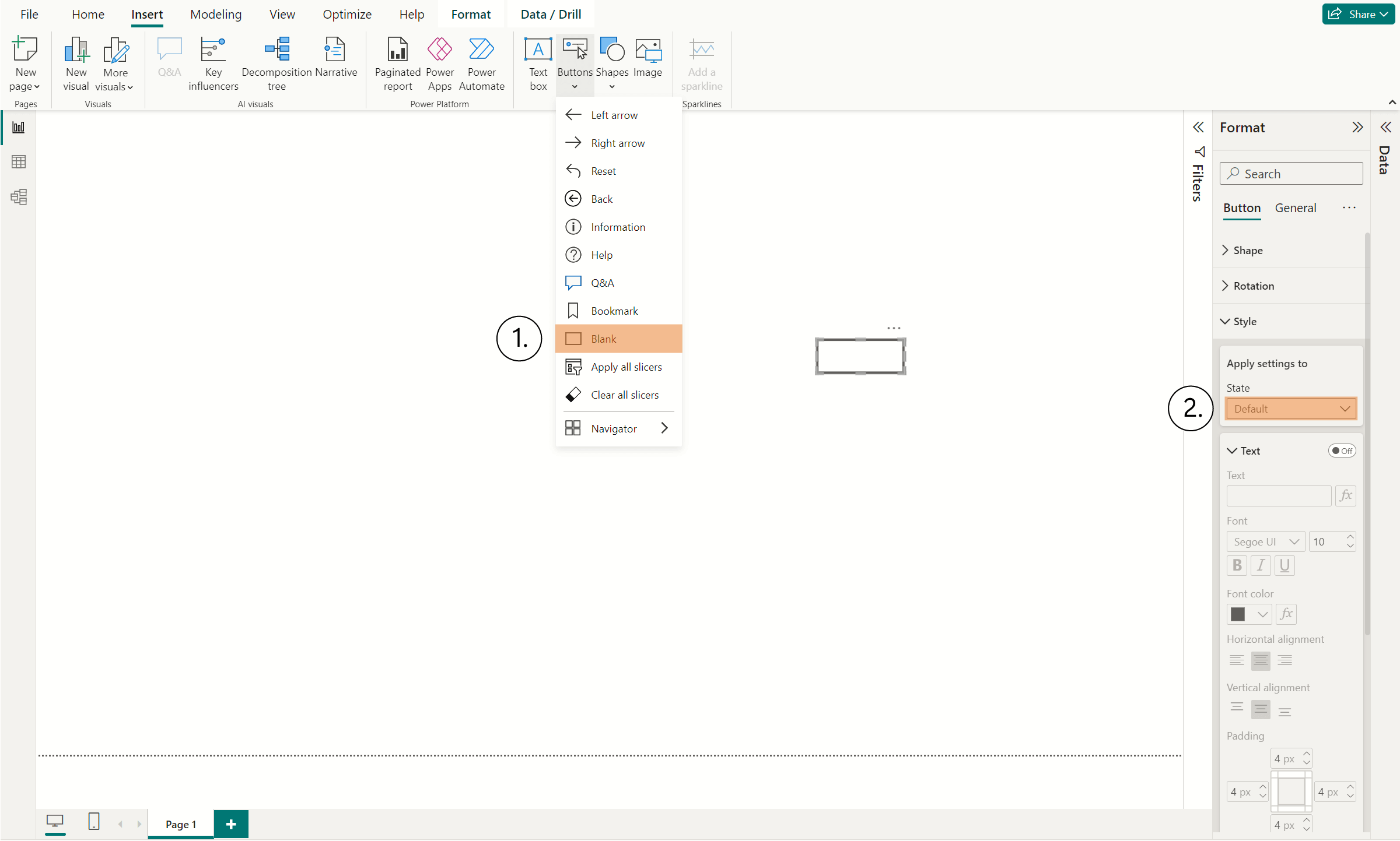
The next step once we have designed or collated all of our creative collateral, is to build our side nav. We switch back to Power BI and start by opening insert tab in the main menu and selecting the button option. We select blank option from the dropdown because we are going to make a custom button. You should make sure that in the side menu you are on the default setting. The default tab saves a lot of arduous work because it places the icon and the state across each of the states. What you should see is a blank rectangle ready for your custom settings.

Under the icon tab in the side menu, you will need to select Custom from the dropdown. That will expose the custom icon finder below. This will allow you to add your custom icons. What we do at this point is set one button up, going through all the states and what Power BI will do is retain the states so all you have to do is swap the icon out. Make sure if you’re swapping the icons that you do this under the default tab otherwise Power BI will retain the initial icon on the other ‘on-hover’ and ‘pressed’, and ‘disabled’ states. When you have your base button set up you can copy this as many times as required.
When we have all our buttons in place, we can add some final additions to our navigation like a background and branding. Starting with a background we add a base colour depending on whether we’re working in a dark or light theme and send this to the back behind our buttons. This helps to ground the navigation to the page and give it presence. When we’re adding branding to the report, we tend to place this in the top of our navigation so that it occupies the top left-hand corner.
This helps lift the navigation off the page; we take a rectangle and make it slightly smaller than the background. We then apply a subtle drop shadow which helps to lift the navigation. It just wants to be enough to highlight this area, so the drop shadow wants to be a subtle hint. Subtlety is the key.
Final thoughts and recommendations
In this post we have walked through how to build a custom navigation bar in Power BI, how the navigation can enhance the layering of your data storytelling. The process is quick if you have all the collateral ready, it takes minutes to compile a button that reflects your brand language. It's ideal for instances where you require bespoke navigation, bookmarking, and links. You can extend your brand language through design and developing icons for new instances. However, if designing is not your primary focus, then we have provided a series of well-defined icon libraries where you can select from a range of designed icons to suite your needs. It's a great way of extending your visual identity across all aspects of your data visualization and reporting UI.
We hope you’ve found this article useful in developing your own navigation.